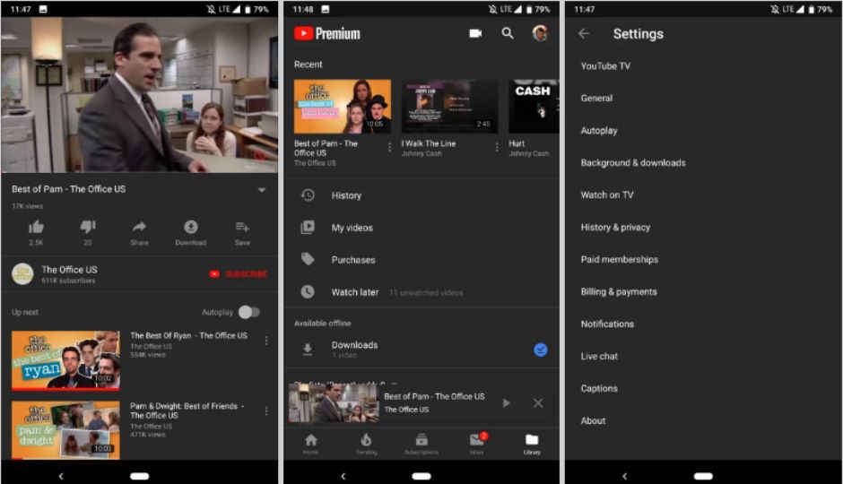
 YouTube has rolled out two major updates over the weekend. The first update is the release of the ‘Dark Theme’ for Android users and the second update is related to the YouTube player size on different mobile phones. The latter will now fill the black space on the sides of a video when it is being seen in the landscape mode. The updates are being rolled out in a phased manner. Let us see in detail what these updates bring to the users. Dark Theme In March, YouTube announced that it is working on a dark theme which, it said, will be rolled out to the Android and iOS app. The update was first launched for iOS users to match the revamped web version, and now it is finally being released for Android users. Some users in the US have started to see the dark theme automatically being applied to the YouTube app on Android, along with a pop-up on the bottom of the screen notifying them about the update. Also, there is an option to turn the dark theme off. If you are one of the users who have already received the update and want to revoke the dark theme manually, you can go to Settings and tap the General option. You will see a list of sub-menus and just under the “Remind me to take a break” feature, there will be a new “Dark theme” toggle. When you turn the theme ‘On’, the app’s background, settings, search pages, among other things turn black. However, ‘Channels’ retain their respective colour-laden app bars. Change in the YouTube player size YouTube has also announced that the videos which are being played in the landscape mode will automatically fill the black stripes on the sides of the video player. The change has been made irrespective of the display aspect ratio. Earlier, for non widescreen videos, that is, vertical and square videos, the player used to show black bars alongside the video, making the video really small. The player now automatically adapts to provide the best viewing experience based on the video’s size (aspect ratio) and the phone’s display. For the vertical videos, the black stripes are now changed to white colour. When it comes to the standard 16:9 videos, the update uses some of the screen’s extra white space to enhance the video size without impacting the quality of the video. The update is being rolled out to both Android and iOS users. Cover Image: 9to5Mac Intext Image: Google Forums
from Latest Technology News https://ift.tt/2viY4YW
via IFTTT


0 comments:
Post a Comment